Mozilla Firefox 3 Beta 1:
Opera 9.50 Beta:
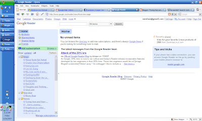 Touted by it's developers as the fastest browser in the world, Opera have it's own share of fans that will swear their life by it, and it's by no coincidence that it is so.
The page loading and rendering performance of this browser is the best so far among the three browsers previewed here today. And for convenience, the fast forward and back ward buttons estimates the most likely next page that I will be going to, a neat feature if you ask me. The memory footprint of this browser is the smallest of all, at 93mb with the same amount of tabs opened (not too small after all). This browser had also passed the ACID 2 test. Note that this memory footprint is measured without any widgets and bit-torrents running.
The other neat features of this browser is the speed dial and the widgets. Speed dial works just like how it would work on your cell phone. Whenever you opened a new tab to browse another site, there will be nine buttons, in which you can define the addresses of your most frequently visited sites. Click on one of the buttons and your destination will magically load up in the tab for your viewing pleasure. The widgets works exactly like how Yahoo! Widgets or Apple Widgets works, by putting useful pieces of applets on your screen that you can call in and out any time. The applications for the widgets will range from a simple clock on your desktop to very complex ones like stock analysis over the past few days, or even time wasters like an aquarium games
Opera gives the most amount of space within it's browser for web-surfing, which is a very good thing. It gives me more space to look over things before I need to start scrolling and the browser itself won't be a big distraction as well.
For privacy advocates, they will be pleased to know of the existence of a private surfing mode that enables them to surf the net without leaving traces behind.
The main complaints that I have for this browser is that it sometimes just failed to load some pages for some reason and just hangs there without giving a timeout. This leads it to just stay there saying that it's still loading the page. I had to stop the loading process and load the page again to get it moving, which is a tad inconvenient if you ask me. And, when the page is from a brand new site that have not been visited recently, it takes more time than both Firefox and Safari for the initial load, sometimes lasting up to 20 seconds. After that, surfing the rest of the site will be a breeze since the caching mechanism had saved a few static features of the page.
The Bit-torrent feature had failed to work on my overly complex network configuration, in which I haven't found out why.
Opera also renders some sites incorrectly, resulting in an outright ugly look of the page. So far I have only seen this happening only once, in the AMD website that I was browsing when I was looking for positions for my practical semester a few weeks ago.
The lack of an addons system does limit the potential of this browser, though it does mitigate the need for it by integrating some very powerful features that are available in Firefox only after installation of add ons (Mouse Gestures comes to the mind).
It's fast, it's compact and it's powerful. Opera is set to become better and better in the future. It might even replace Firefox as my main browser if not for the rendering problems.
Safari for Windows 3.04:
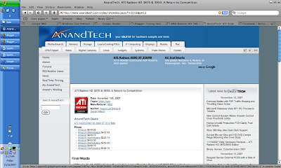
Safari is a relative newcomer to the internet browsing world under windows. It's bundled in Mac OS as the default browser, and since July this year, windows' users can also get a feel of how it feels to surf the net using Safari.
Once installed, one of the first things that I noticed about the interface is just how similar it looked like my music management/playing software, iTunes. It is clean and neat, and even with lots of tabs open it doesn't look as cluttered as Firefox can be.
Another things that people will notice is the way anti aliasing works here. it doesn't use the default windows' method to do it, but employs it's own algorithm. The result is, the fonts generally looks blurrier than normal, but are more loyal to the original shapes of the fonts. This results in a big debate on whether Apple should pursue the Mac experience with Safari, or make Windows users comfortable with it. For me, I kinda like the slight blurriness of the words. It looks better than windows fonts and made it more readable, which is important for a person who surfs the net all the time like me.
The options menu doesn't provide much options to configure the browser with, which I think is a boon for the more novice users since they will have less settings to break. The power users might be frustrated with the lack of configurations available to them though (people like me like to tweak all aspects of a program to ensure it works exactly the way we want it to) :P
Performance of this browser can be summarized as very good. It loads pages at a generally faster speed than Firefox, but a bit slower than Opera (all are at almost the same level). The memory usage, however, can be improved upon. Using 230++Mb or RAM is unacceptable for me, especially if it only have a few tabs open. I hope that Apple can fix this problem in future releases of the program, especially if they would like more and more users to use it. I have yet to encounter any rendering problems so far (except for one very poorly coded Friendster page).
It's inability to save the tab contents across browsing sessions disappointing, considering that the other two browsers previewed here have implemented this feature for quite some time already. This shortcoming can be compensated by it's ability to save groups of tabs together, which will be the first button that I will click on everything I start it up. The feature is good, and the addition of a session saving feature will certainly make up the requirements that I have for my browser.
Another gripe that I have with Safari is having to right click on downloaded items in order to start them up. In the other browsers I can just double click on the downloaded items in the download window to start it, and I would expect it to behave the same way here. Not a major complaint, but it makes up my browsing experience.
Safari have strong features to enable it to compete with the other big names in the area, but it needs a bit more polish to win it. Of the looks of the three browsers, I like Safari the most, especially the way it renders fonts. Apple would have to keep on improving on the memory footprint though, and hope the next version will use less memory.
That's all to my very subjective review of these 3 browsers, I will still continue to use Ff3.0 beta as my main browser for this time around, as it is the more familiar browser to me. Till the next time I post anything, c'ya guys, and don't get sick like me now...
Cheers
seehua
*Let's create a world full of Love~
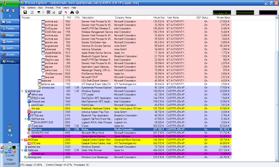
p/s: here is a view of the memory usage of various programs in my system. This entry will be edited as i spend more time with the said browsers...

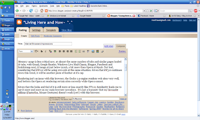
The successor to the increasingly popular Mozilla Firefox family of web-browsers, this one have big shoes to fill in. People are starting to take note of it,and a lot are switching to it after experiencing the benefits of safer browsing, the innumerable addons that are available and the easiness of it's usage.
For the last month, I have been using the Alpha 8 (Grand paradiso 8) version of Firefox 3.0, and I have to say, I am impressed by the improvements made to it.
It successfully passed the ACID 2 test from the webstandards.org ensuring that I can render any sites coded according to standards properly. To take the test, you may go to this page. In addition to that, site loading times were vastly improved over that of Firefox 2.0. It's so fast that it's site loading times were almost on par with that of Opera 9.5, just a few miliseconds slower. It's memory footprint is smaller this time around, hovering at 96Mb with 5 tabs open.
It's interface looked like the one from Firefox 2 at first glance, with the one and only new element named the "places" folder at the bookmark bar. (As of now, I am still not sure of what this feature actually do, so I have no comments on it) Within the menu structure there are a few new interface upgrades over the last version. The downloads windows is now searchable, enabling me to search for downloads that I have made. The options page have an extra tab listing out the programs for most types of files. And on the security front, we have a malicious site checker that, when turned on, will warn the user from visiting a site that is potentially damaging to the computer. We will have 2 choices of malicious list to choose from, one from a public list maintained by Mozilla and another one provided by Google.
And under Linux, the Mozilla have improved on the integration with the Gnome and KDE-based desktop environments by using their default looks and buttons. This means no more ugly Firefox that doesn't follow the general looks of the desktop space.
And under Linux, the Mozilla have improved on the integration with the Gnome and KDE-based desktop environments by using their default looks and buttons. This means no more ugly Firefox that doesn't follow the general looks of the desktop space.
Spell checking is still available from that program, and it will continue to assist me in writing error free posts to blogger and various forums. It's just too bad that it isn't available in the other browsers.
However, there are still a few drawbacks inherited from it's predecessors. Installing addons/themes still requires a restart, which is inconvenient. The browser still takes more time than both Safari and Opera to start up and shut down. Navigating in between pages via the forward and back buttons revealed another area where Firefox can improve in, the rerendering of pages should have taken a shorter time.
Mozilla 3 had coded a lot of improvements into the No. 2 top browser in the world, and I hope this continues on, enabling lots of people to enjoy enhanced web-browsing experience.
Note: Firefox 3.0 Beta have not been released into the public. If you want to get your hands onto it, you will have to do a bit of digging online.
Note: Firefox 3.0 Beta have not been released into the public. If you want to get your hands onto it, you will have to do a bit of digging online.
Opera 9.50 Beta:
 Touted by it's developers as the fastest browser in the world, Opera have it's own share of fans that will swear their life by it, and it's by no coincidence that it is so.
The page loading and rendering performance of this browser is the best so far among the three browsers previewed here today. And for convenience, the fast forward and back ward buttons estimates the most likely next page that I will be going to, a neat feature if you ask me. The memory footprint of this browser is the smallest of all, at 93mb with the same amount of tabs opened (not too small after all). This browser had also passed the ACID 2 test. Note that this memory footprint is measured without any widgets and bit-torrents running.
The other neat features of this browser is the speed dial and the widgets. Speed dial works just like how it would work on your cell phone. Whenever you opened a new tab to browse another site, there will be nine buttons, in which you can define the addresses of your most frequently visited sites. Click on one of the buttons and your destination will magically load up in the tab for your viewing pleasure. The widgets works exactly like how Yahoo! Widgets or Apple Widgets works, by putting useful pieces of applets on your screen that you can call in and out any time. The applications for the widgets will range from a simple clock on your desktop to very complex ones like stock analysis over the past few days, or even time wasters like an aquarium games
Opera gives the most amount of space within it's browser for web-surfing, which is a very good thing. It gives me more space to look over things before I need to start scrolling and the browser itself won't be a big distraction as well.
For privacy advocates, they will be pleased to know of the existence of a private surfing mode that enables them to surf the net without leaving traces behind.
The main complaints that I have for this browser is that it sometimes just failed to load some pages for some reason and just hangs there without giving a timeout. This leads it to just stay there saying that it's still loading the page. I had to stop the loading process and load the page again to get it moving, which is a tad inconvenient if you ask me. And, when the page is from a brand new site that have not been visited recently, it takes more time than both Firefox and Safari for the initial load, sometimes lasting up to 20 seconds. After that, surfing the rest of the site will be a breeze since the caching mechanism had saved a few static features of the page.
The Bit-torrent feature had failed to work on my overly complex network configuration, in which I haven't found out why.
Opera also renders some sites incorrectly, resulting in an outright ugly look of the page. So far I have only seen this happening only once, in the AMD website that I was browsing when I was looking for positions for my practical semester a few weeks ago.
The lack of an addons system does limit the potential of this browser, though it does mitigate the need for it by integrating some very powerful features that are available in Firefox only after installation of add ons (Mouse Gestures comes to the mind).
It's fast, it's compact and it's powerful. Opera is set to become better and better in the future. It might even replace Firefox as my main browser if not for the rendering problems.
Safari for Windows 3.04:

Safari is a relative newcomer to the internet browsing world under windows. It's bundled in Mac OS as the default browser, and since July this year, windows' users can also get a feel of how it feels to surf the net using Safari.
Once installed, one of the first things that I noticed about the interface is just how similar it looked like my music management/playing software, iTunes. It is clean and neat, and even with lots of tabs open it doesn't look as cluttered as Firefox can be.
Another things that people will notice is the way anti aliasing works here. it doesn't use the default windows' method to do it, but employs it's own algorithm. The result is, the fonts generally looks blurrier than normal, but are more loyal to the original shapes of the fonts. This results in a big debate on whether Apple should pursue the Mac experience with Safari, or make Windows users comfortable with it. For me, I kinda like the slight blurriness of the words. It looks better than windows fonts and made it more readable, which is important for a person who surfs the net all the time like me.
The options menu doesn't provide much options to configure the browser with, which I think is a boon for the more novice users since they will have less settings to break. The power users might be frustrated with the lack of configurations available to them though (people like me like to tweak all aspects of a program to ensure it works exactly the way we want it to) :P
Performance of this browser can be summarized as very good. It loads pages at a generally faster speed than Firefox, but a bit slower than Opera (all are at almost the same level). The memory usage, however, can be improved upon. Using 230++Mb or RAM is unacceptable for me, especially if it only have a few tabs open. I hope that Apple can fix this problem in future releases of the program, especially if they would like more and more users to use it. I have yet to encounter any rendering problems so far (except for one very poorly coded Friendster page).
It's inability to save the tab contents across browsing sessions disappointing, considering that the other two browsers previewed here have implemented this feature for quite some time already. This shortcoming can be compensated by it's ability to save groups of tabs together, which will be the first button that I will click on everything I start it up. The feature is good, and the addition of a session saving feature will certainly make up the requirements that I have for my browser.
Another gripe that I have with Safari is having to right click on downloaded items in order to start them up. In the other browsers I can just double click on the downloaded items in the download window to start it, and I would expect it to behave the same way here. Not a major complaint, but it makes up my browsing experience.
Safari have strong features to enable it to compete with the other big names in the area, but it needs a bit more polish to win it. Of the looks of the three browsers, I like Safari the most, especially the way it renders fonts. Apple would have to keep on improving on the memory footprint though, and hope the next version will use less memory.
That's all to my very subjective review of these 3 browsers, I will still continue to use Ff3.0 beta as my main browser for this time around, as it is the more familiar browser to me. Till the next time I post anything, c'ya guys, and don't get sick like me now...
Cheers
seehua
*Let's create a world full of Love~
p/s: here is a view of the memory usage of various programs in my system. This entry will be edited as i spend more time with the said browsers...

No comments:
Post a Comment